IBM Design Language
The IBM Design Language provides the guidance and assets used to express the IBM brand in products, communications, marketing, events and digital experiences.
IBM is looking for a new design language that expresses a bespoke point of view, and comprehensively guides all design work in the company, ranging from digital experiences such as products and marketing, to physical including events, workspaces, and industrial design.
See the latest IBM Design Language below:
IBM is over a century old. This unique, rich heritage of product design — from the Selectric typewriter, to System 360, and to Watson’s sensational breakthrough — are all inspirations to the new IBM Design Language.
Our work is based on the previous iteration of the design language, created in 2015. This set of guidelines are visually vibrant, easy to apply, and genuinely fun to learn. It breathed a new life to the company at the time, and became the face of digital products including IBM Blumix (later IBM Cloud). It introduced a sense of discipline to the malleable culture of thousands of newly hired designers, to not just sketch and create, but to be an extension of the brand and adhere to guidance.
Once the design culture matures, and the standard of design rises, it becomes clear that there are opportunities for improvement. In 2017, we are ready to revisit all aspects of the design language, and unify across mediums beyond digital. Our team is expanded to include the best designers from all over the business, representing brand, products, and marketing. Under the leadership of Mike Abbink, Hayley Hughs, and other visionary designers, we began seeking a level of thoughtfulness and sophistication that accurately reflects the company’s brand philosophy and century-long history, with the goal of making this visual identity distinguished from competition, and timeless.
Emerging from the company’s history is a theme that IBM’s worked to serve as a medium between mankind and machine. Inspired by these recurring dyads, the project is code named Duo. As designers, we create value by defining the relationship between the two states:
The purpose of our design is to guide… to lead, to provoke, to provide, to progress, to move people emotionally and functionally forward. We centered the new design language around the statement: Think → Guide.
We centered the new design language around the statement: Think → Guide.
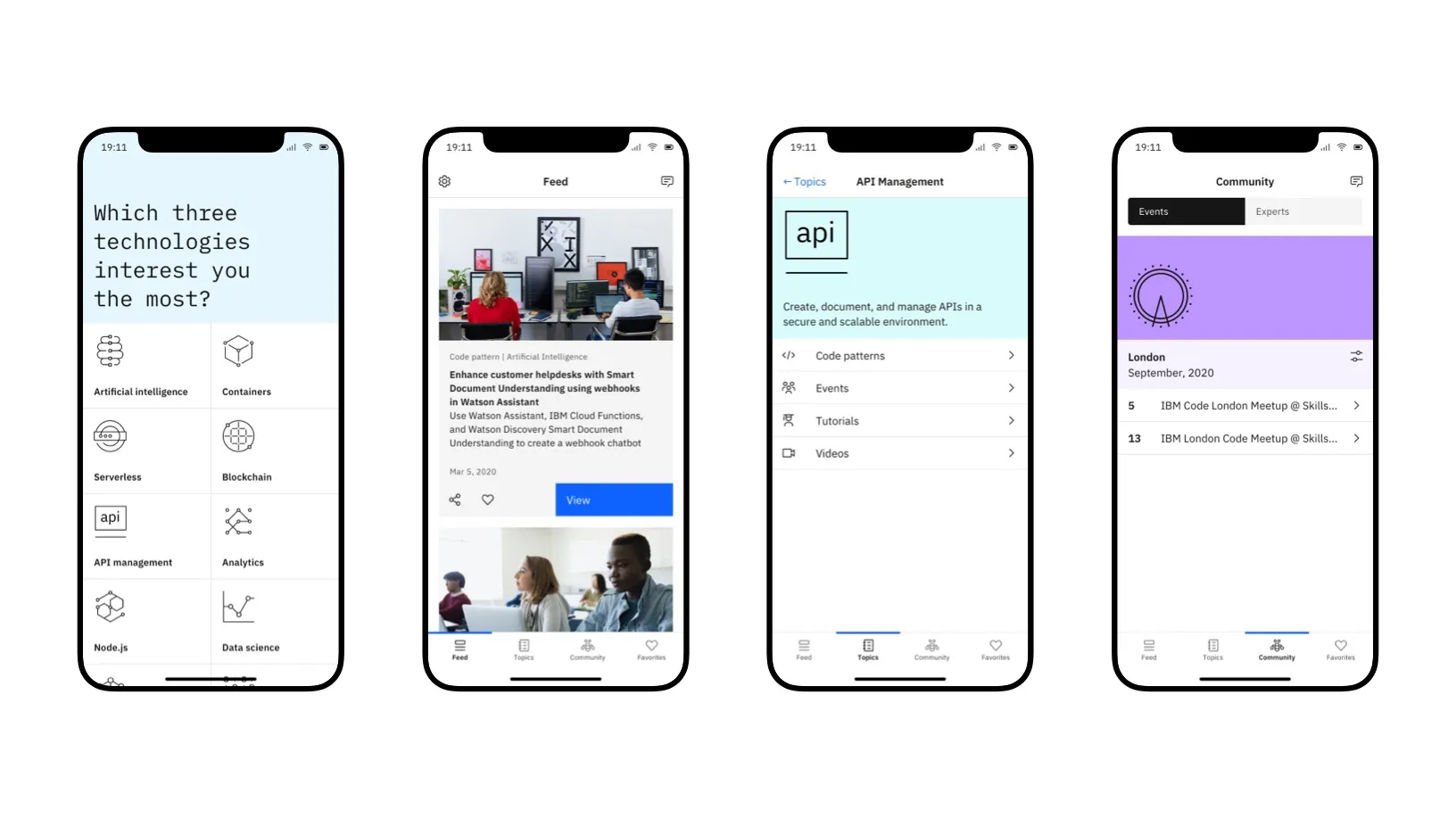
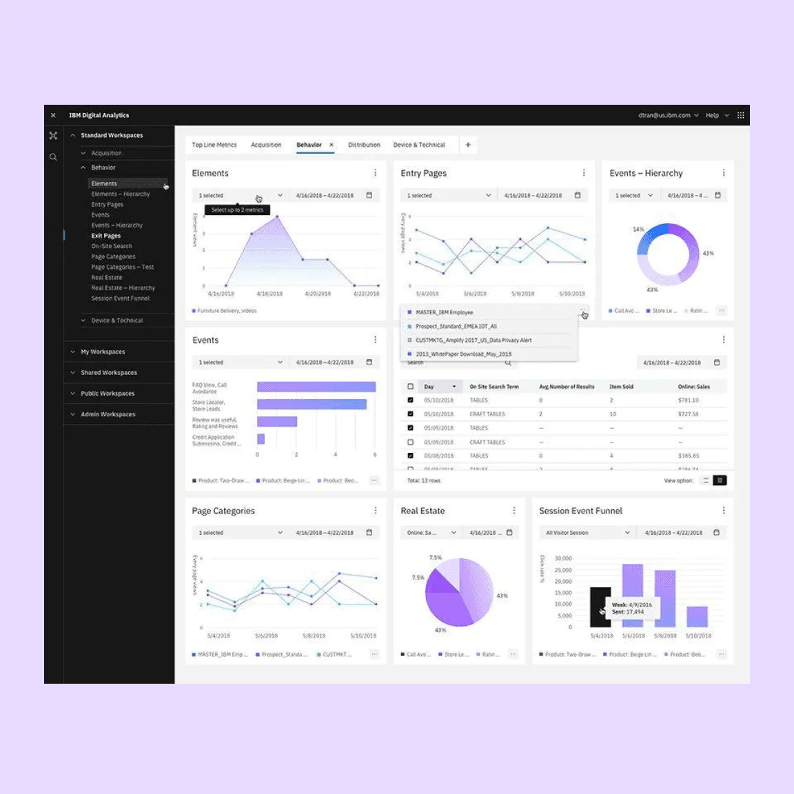
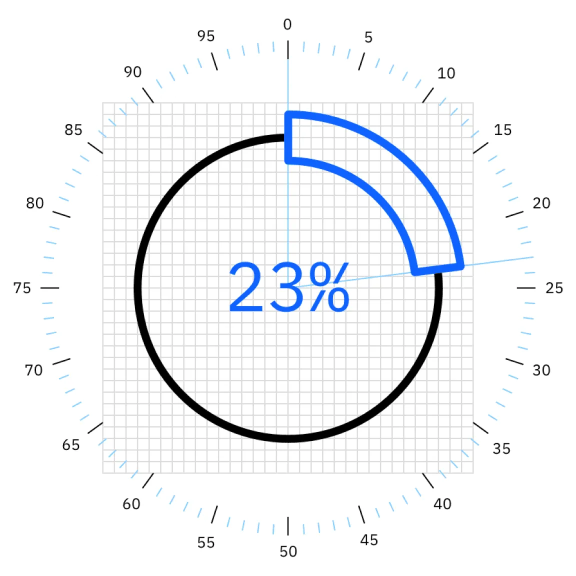
In the next few years’ time, we worked on translating this point of view to all things visible. I got to own the worktream on Motion with Wonil Suh, and was heavily involved in the workstreams for Color, Grid, Typography, Iconography, and Illustration. Later, I led the design of Carbon Charts, IBM’s Data visualization library.
Wonil Suh and I partnered to create the new Motion guidance. We quickly arrived at a concept that the motion in IBM’s digital products should come in two flavors: productive and expressive motion. This allows the system to demonstrate a sensitivity to context, differentiating between messaging and feedback by communicating with different speed and strength.
For more details on this aspect, please see project Carbon Design System.
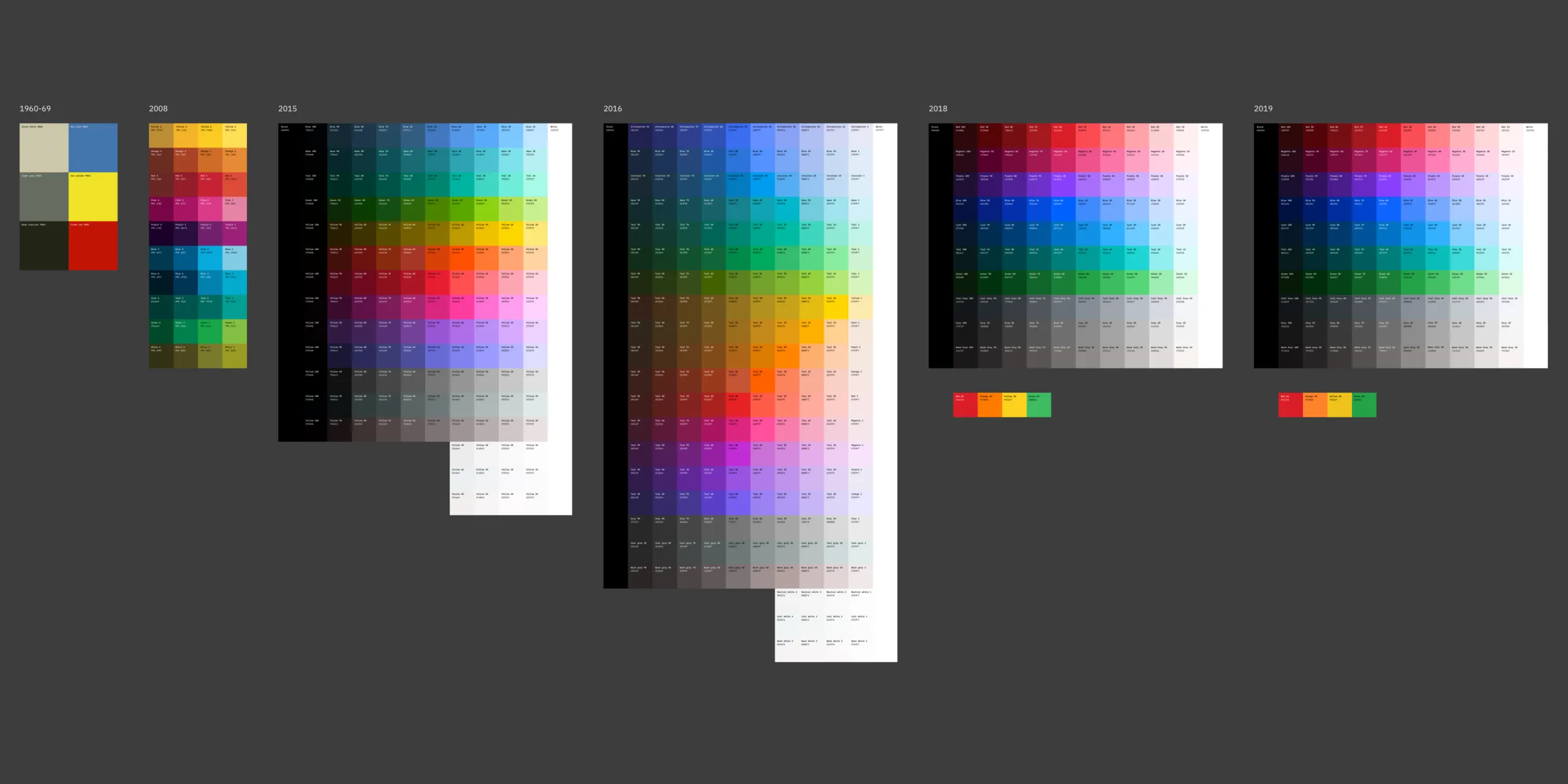
Color was a highly challenging area. I was fortunate to be an understudy of the eagle eyed Sadek Bazaraa during this work. I conducted an accessibility evaluation of the color palette for digital product usage. Tuning each step between the ten shades of each color family. I’m very proud of where we have landed. For details of my work on the Color palette, please read my blog “Because, colors are beautiful”.
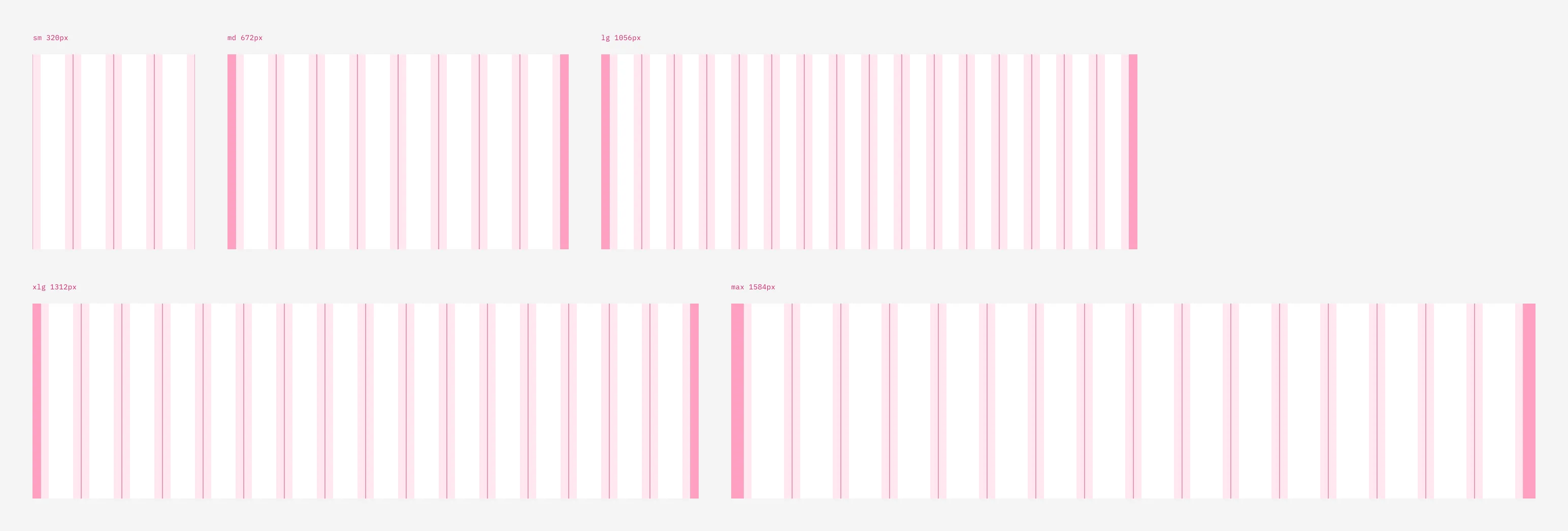
At the core of the 2x Grid concept is the idea of divisions of two. This can be applied to most surfaces, 3-D objects, and architecture as a means to divide space into a helpful grid system. The concept echoes the logic behind the IBM 8-bar logo.
We consider the grid the most fundamental aspect of the IBM Design Language. Leaning on this highly recognizable grid, we can design unified experiences in both the physical and digital world.
In digital products, the grid is used as a template across breakpoints, defaulting to 4, 8, 16 columns. This grid enforces a bold layout grounded by strong proportions.
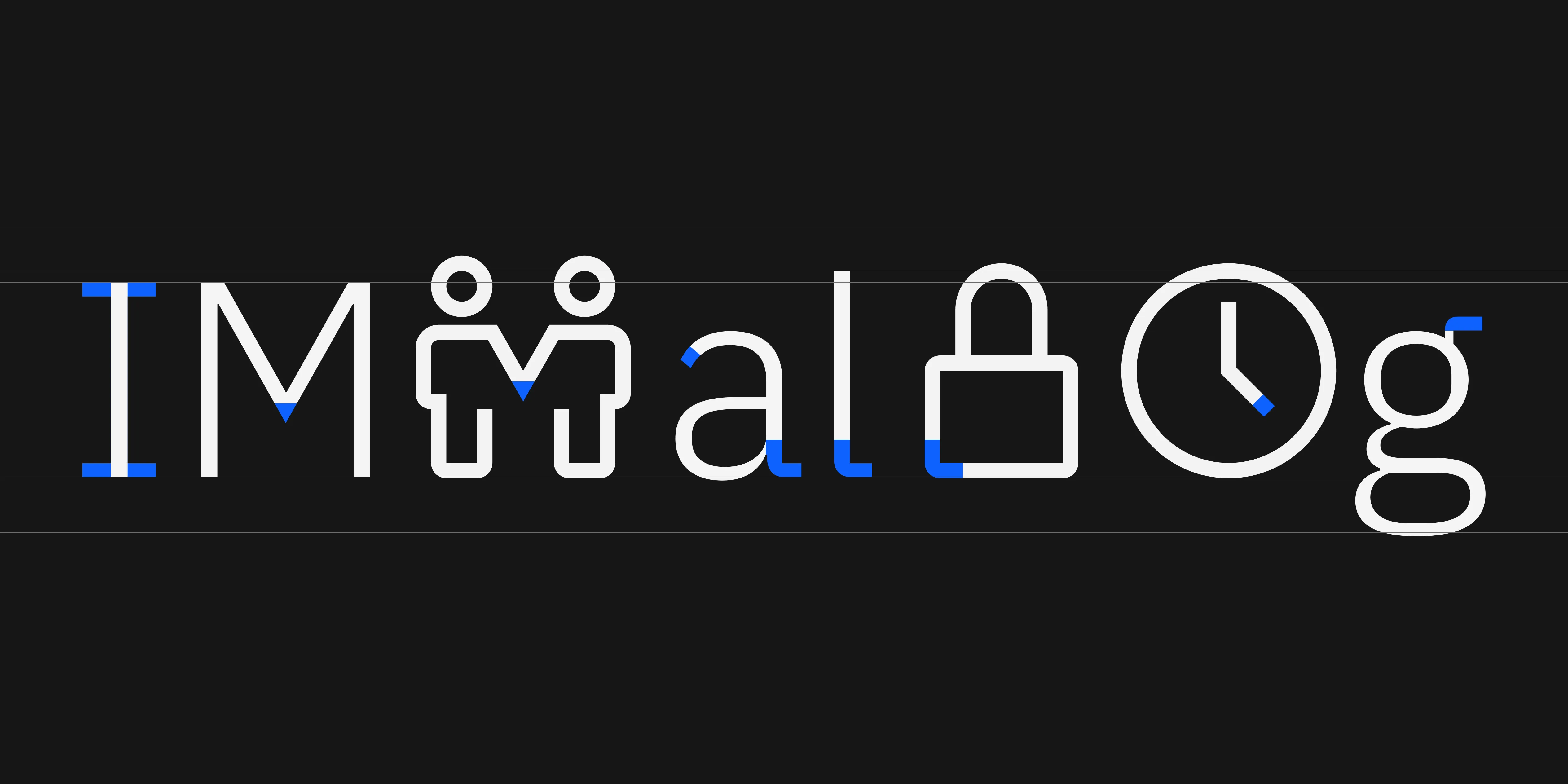
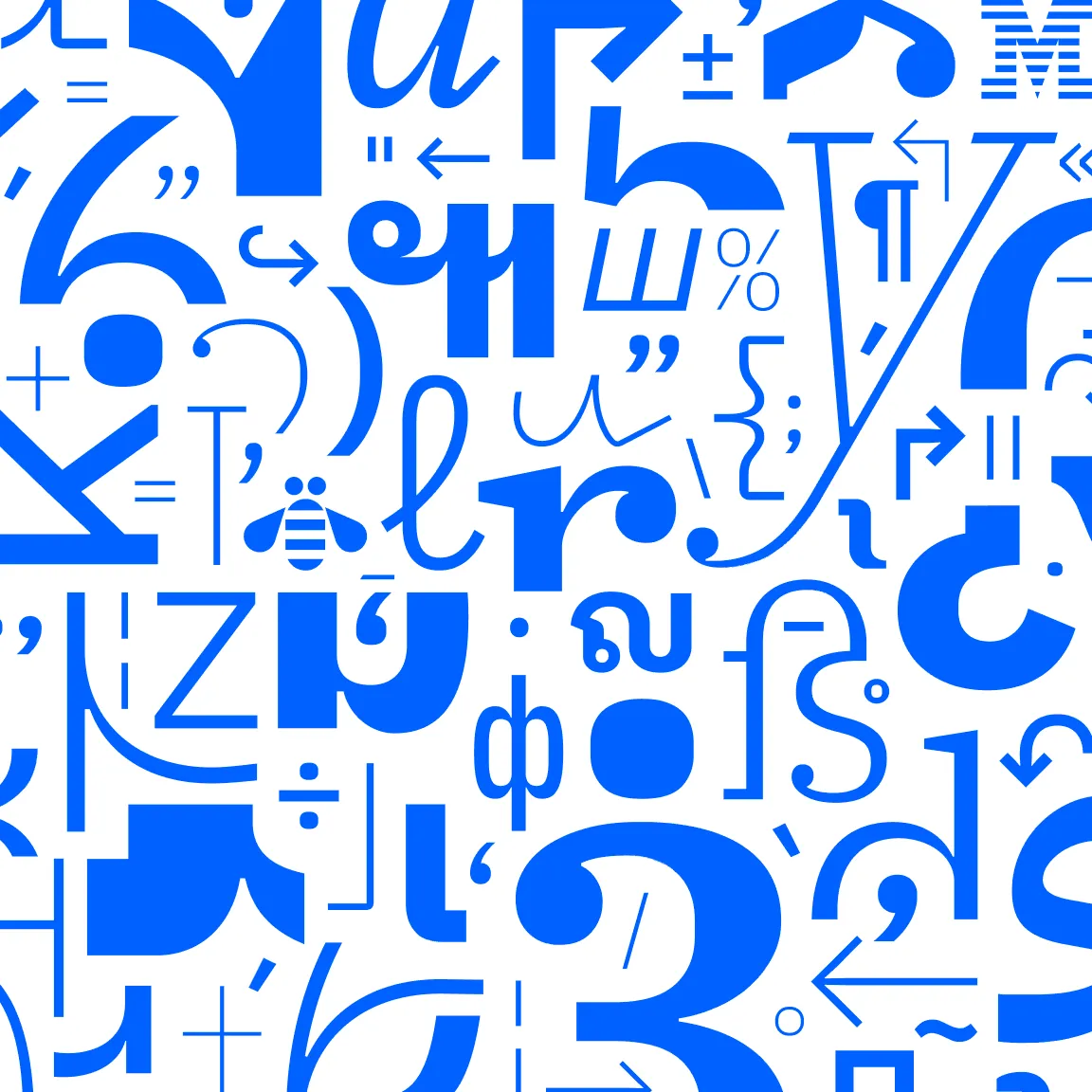
The new set of icons are designed to work harmoniously with the brand bespoke typeface, Plex. Instead of emphasizing mechanical characteristics in the previous icon set, such as sharp angles and strong contrast, the new icons demonstrate a balance of human and mechanical characteristics. The corners are rounded on the outside, and square on the inside; stroke weight is even; drawings often show strong symmetry, and proportions adjusted for optical harmony.


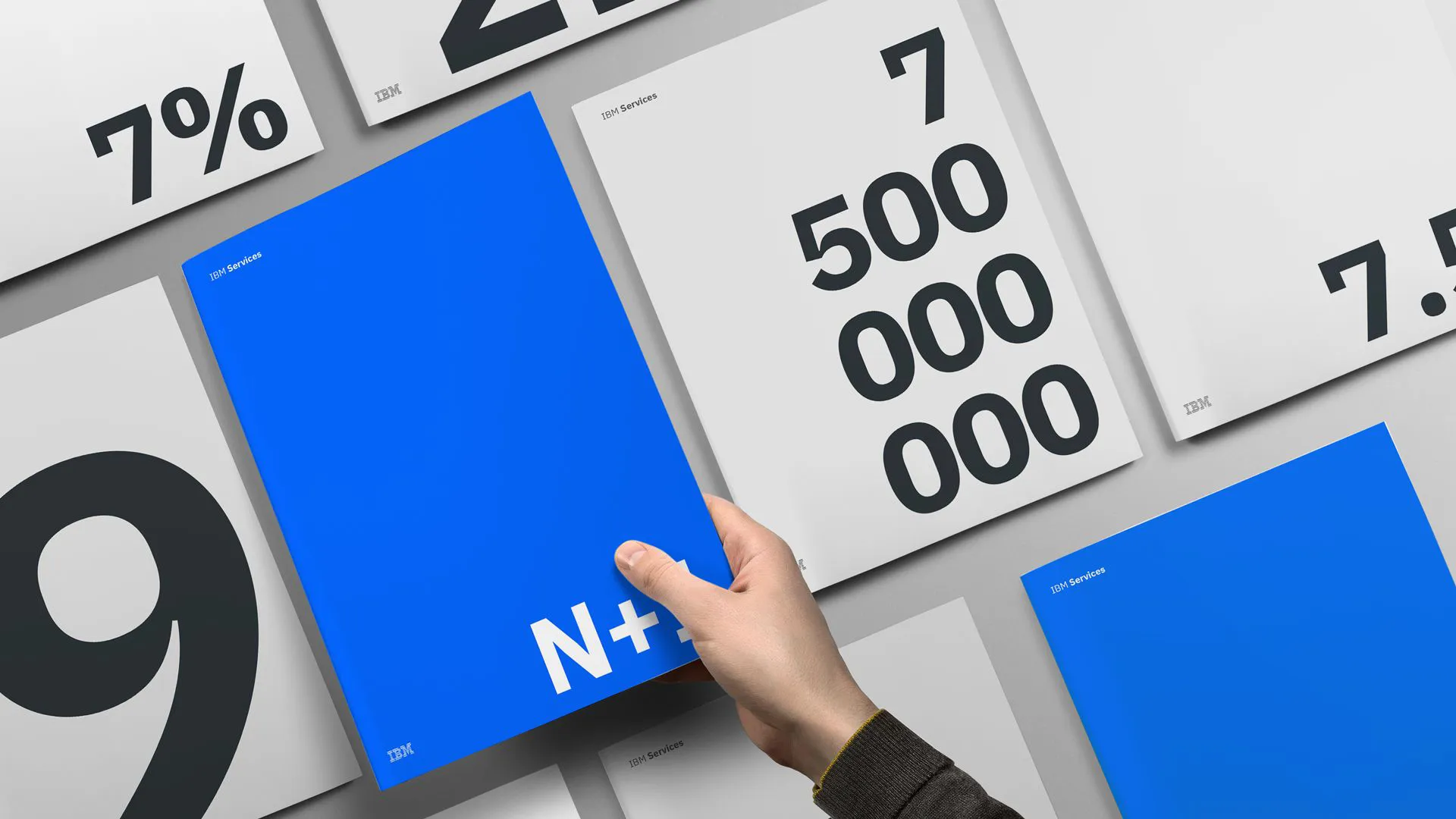
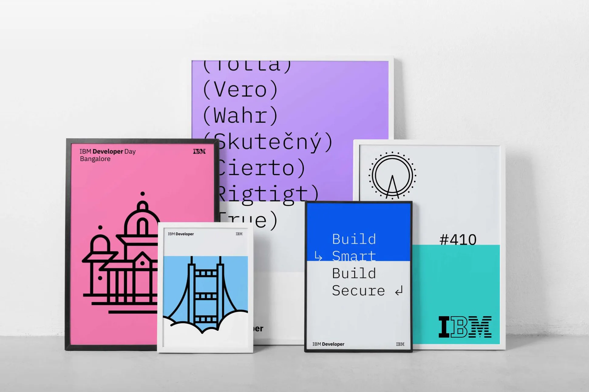
Since launch, the new IBM Design Language has gotten generally positive feedback throughout the design community. Thanks to the growing executive support, over the last 4 years, the redesigns are finally starting to ship to the hands of our customers.
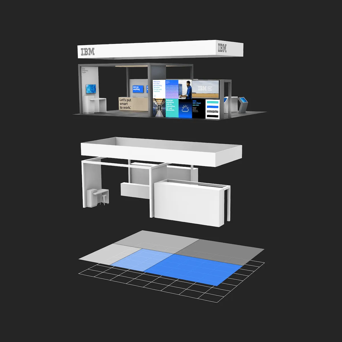
Hopefully the language will eventually connect all touch points of a customer’s journey, starting from a web page, extending all the way to a physical event, one can recognize the same blue, the same division in the grid, and consistent attention to details.

Creative director: Mike Abbink
Project leads: Hayley Hughes, Daniel Kuehn
Design: Sadek Bazaraa, Chiu Ping Chiu, Wonil Suh, Shixie, Ryan Mellody, Inhee Bae, Pete Garvin, Conrad Ennis, Erica Raymond