Carbon Design System
Motion can bring the screen to life, guide users through complex experiences, and help move them forward—from here to there, now to next, start to finish—and make progress.
Carbon is IBM's official design system for all digital product experiences, and one of the most acclaimed design systems in the industry. As a design lead, I owned the Motion and Color in UI guidelines during the Carbon V10 release, and helped deliver many components. Over time I also took on product management, and developed processes effective for scaling and measuring impact.
Carbon Design System began as a reusable library for IBM Bluemix, later IBM Cloud. The new IBM design language was released when Carbon was still in version 9. I joined the Carbon team with the mission of updating Carbon to the new Design Language, creating Carbon version 10 (Carbon V10).
Carbon V10 was released in 2019 and V11 didn’t come out until 3 years later, making V10 a release with the most far reaching impact so far. It was adopted by hundreds of products throughout IBM over the course of 3 years, enabling a brand refresh in end-user experiences at an unprecedented scale.

Motion can bring the screen to life, and guide users through complex experiences. As an ex-motion-graphics designer, I am a believer in the power of moving pixels. I jumped into this project hoping to inspire and enable the rest of the company to embrace motion design in UI.
Wonil Suh and I were partners in crime for this project. IBM brand philosophy emphasizes the existence of dichotomies within relationships: ours is between man and machine, between the organic and engineered, between service and society. Through this lens, we audited IBM products for existing motions and opportunities for adding motion; and we found a duality in the type of needs:
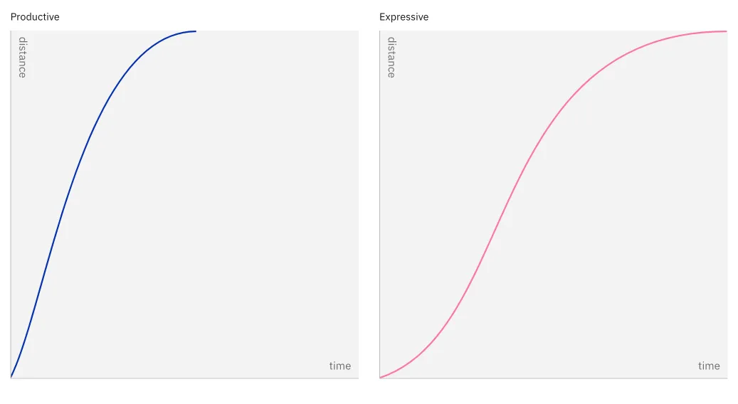
We designed Carbon motion to speak in two modes : productive and expressive. Productive motion is quick and efficient; best used in microinteractions to show the UI is responsive and functional. Expressive motion is smooth and gentle, best used when the system needs to interrupt the user, perhaps with a notification message.
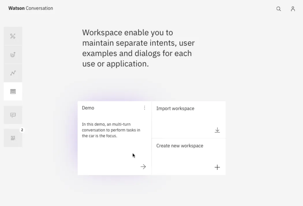
An in-context (Watson Conversation prototype) example shows both modes of motion work together in harmony to create a focused, fluid experience.
In the timeline at the bottom of the video, productive moments are labeled in blue, and expressive moments are labeled in magenta.
Around this time, Google Material and Microsoft Fluent design systems established their design metaphors around physical mediums: paper and acrylic. In reviewing of our design direction so far, it feels limiting to imitate a tactile material, when pixels and light on glass is what digital experiences really are.
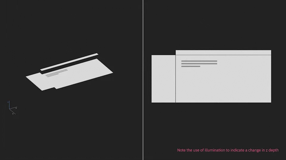
We proposed light to be our medium, and explore the power of shadow vs illumination.
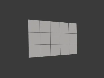
The addition of motion expands users’ peripheral awareness of the screen. Users are anticipating the menu to often slide in from the left, and corners of the window are where to look for transient toast notifications.
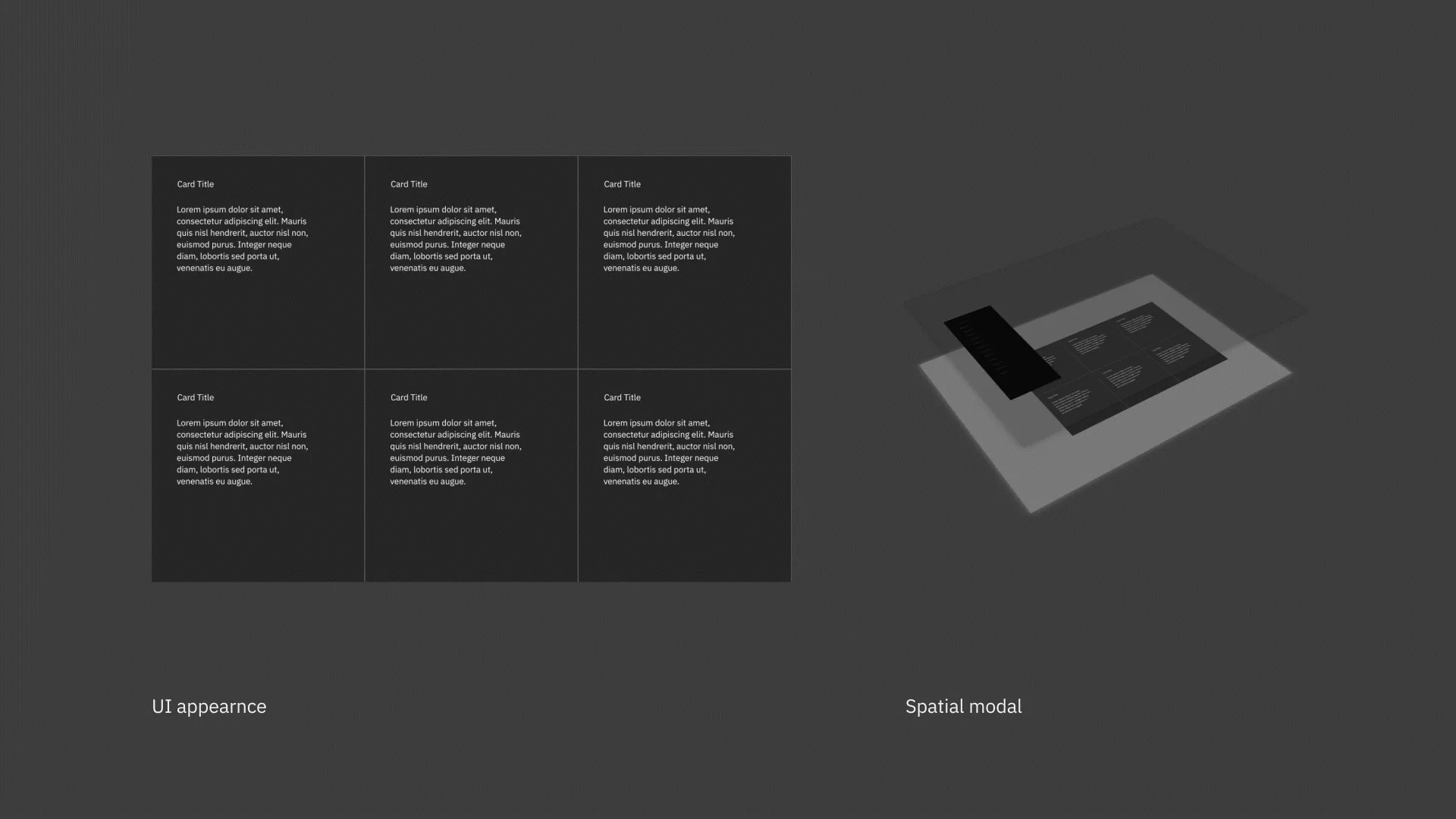
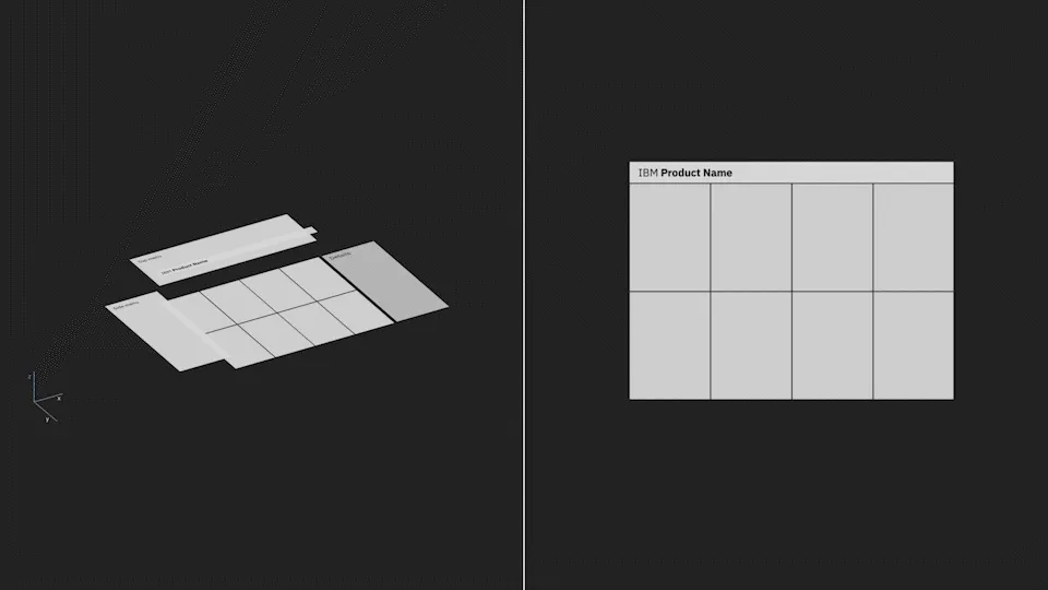
But this can also enable the designers to conjure up unexpected motion that is more akin to an intrusion, such as the feeling elements can fly into the screen from all directions. To avoid this, we developed a spatial model to govern layering, lighting, and position of elements around the screen, which is now only a viewport of a much bigger, deeper world.
Beside the website documentation, in this project we also delivered tooling to help with Motion design adoption. Checkout the Carbon Motion package and Motion Generator
This is a conceptually satisfying and technically challenging project. Even though not all concepts are ready for wider adoption within IBM, it was personally very rewarding and many colleagues believed in its long term value.
With like-minded people passionate about motion design, we later formed the IBM Motion Guild, thanks to the organization and leadership of Lisa Kaiser. Together we continue to look for opportunities to bring user experiences to the next level with motion design.
Creative director: Mike Abbink
Project leads: Hayley Hughes, Daniel Kuehn
Design: Wonil Suh, Shixie